The past few years newspapers made their appearance on web. Due to technological restrictions the newspapers’ appearance, in terms of the layout, appear completely different than the printed newspapers. The emotional impact on the users who visit the newspapers on the web has changed. The use of e-newspapers is increasing in Greece. What are the differences in the aesthetics of the layout of the e-newspapers in comparison with the printed newspaper? Do users understand the difference and how this change in layout affects their emotion in terms of the news retrieval from the e-newspaper?
Keywords:The look and feel of the layout of e-newspapers is different that the aesthesis that the reader of the printed newspaper has. This affects the users/readers’ emotions while navigating an e-newspaper. Media houses and publishing companies adjust the layout design of e-newspapers in such a way that there is room for as many ads as possible in order to stay in business and have a vital and healthy interactive department. The website due to the load of ads becomes heavier and as a result the room for information and closer look and feel to that of a printed newspaper is impossible technically.
This paper discusses and analyses the emotional effect of the users as well as the changes and differences in the design of the newspaper and the aspects lost in the effort of publishing houses to adopt the new way of appearing the news on the web and other media of new technology.
This study has been carried out partly retrospectively through studies of literature, and partly prospectively through qualitative interviews, questionnaires and a focus group. The research concerned speaking with designers, programmers, marketing departments, web development teams, publishing houses and new media companies. In order to have a full understanding of the emotions of users a focus group of 12 people was asked using both an electronic and a printed questionnaire.
Obviously, the main differences in the design of an e-newspaper is the size in comparison with the printed one as well as the font size in terms of titles and subtitles and the way that an article is presented in the printed newspaper in comparison with the electronic one.
As mentioned in methodology, in order to understand what do users feel while navigating/reading an e-newspaper in comparison to the printed one a focus group was questioned using an electronic and a printed questionnaire. The focus group was a group of 12 people, 6 males and 6 females from various classes in financial status as well as in educational status. What are the results from this survey?
It’s cheap, it’s easier as they do it from their offices and they don’t have to carry all this huge amount of paper in their hands. They visit websites of newspapers they don’t buy. This information comes also from the Administrator of a daily Athens newspaper who replied that most of the visitors of the website are people who don’t buy this specific newspaper.
When they were asked to visit the website of their favorite newspaper and comment on it most of them said that they find it boring, they don’t like visiting the website of their favorite newspaper as the look and feel ruins their emotional aspect in terms of what they feel when they hold in their hands their favorite newspaper. They believe that the news on-line are not the same as the ones in the printed version even when they were shown the same article, published in both versions. When they were asked what they like most in their newspaper in terms of design, most of them replied that they prefer huge titles and subtitles that influence their emotions before reading the article. They don’t mind the size of the pictures; the importance comes in fonts and clarity. They were shown a pilot model of a newspaper in white paper but with colored titles and black and white pictures and 70 percent answered that even though they are used to read a newspaper in black and white with colored pictures, they prefer the pilot one. Further research must be conducted on this area of course but it is interested to see new designs in newspapers not only on the web but also in print. What seems to bother most of them is the appearance of ads in all forms (banners, buttons, popups). It spoils their pleasure while reading. They shouldn’t be here said a few.
Is this the case for newspapers also? No! Do they want just traffic in order to sell more ads in their websites? Yes!
Research has also been made in the visual part of the websites in comparison with the printed newspaper. The comparison is dramatic. Most of the websites look alike no matter the country. They all look like portals. Do users need one more portal in their lives? Where is the aesthetics of a well designed newspaper with the titles and the feeling that you get from print? The people in the focus group answered that most of the times when they cannot any longer see the logo of the newspaper they have accessed on line, they forget where they are. They do not understand the “big news” as most of the newspapers do not keep the titles bigger in font size. When they were asked to criticize the titles and compare them with the sample they were given they all agreed that it’s more attractive and user friendly to see bigger titles with smaller pictures as in this way they understand the importance of the article.
All designers and developers say that the difference in size from screen to paper as well as the bandwidth has made them change the way they prepare a newspaper from print to the one for the web but is this so or does it have to do with the fact that the ads in every page create the basic problem in the download time? Most of the newspapers are black and white or even have a few basic colors that differentiate them from the others. As all pages on the web are designed in a canvas/table like the printed one, how difficult is it to transfer the original printed newspaper on line? Omit the ads and the space is available. Give the user the same feeling that they have while holding the printed newspaper. Do not sell the aesthetics and the feeling of a newspaper for a few ads. Give a link or a division for the ads for anyone who wants to access them. This may sound very romantic and non commercial as we all know that the publishing companies rely on the banners sales in order to survive on line but people will adjust to this in time and they will be even happier if the page is quicker and the news are retrieved easier. The traffic will rise and so the sales but the look and feel of the newspaper will look alike the printed one and as a result the feeling that the user gets will remain the same and in this way the sales of the printed newspaper will rise.
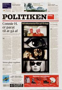
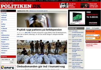
The Society of News Design has announced this years’ winners for the best printed newspaper design. One of the winners is the newspaper “POLITIKEN” from Denmark. The focus group was firstly asked about the online version of this newspaper but without knowing that this is a newspaper as they were all people from Greece and had no idea what they were looking and of course without understanding the language. 50% percent answered that they believe they are in a political party website because of the name of the newspaper that has the same route with the Greek word for politicians. 30% answered that they believe they are in a portal because of the menu and the rest answered that they believe they are in an e-shop because of the ad with the TV on the right. No one checked the tick box for newspaper in the questionnaire. Of course, when they were shown the printed newspapers’ cover they all answered that this is a newspaper.
| Printed version | On line version |
|
|
After conducting the research, the author concluded to the following:
In order to stay in the market and have a financially healthy website, newspapers have lost their diachronic look and feel. The research that has been and will be further conducted in the future for this specific field aims to prove that it is possible to keep the same aesthetical feeling for the user/reader.
An e-newspaper doesn’t differ from any other portal. The emotional impact on users is not the same with the printed one. A frequent reader of a newspaper doesn’t visit the electronic form of the same newspaper because they believe that this ruins the image and feeling they have for their favorite newspaper.
Publishing houses should create a prototype in hard copy using less ads or even not at all in the home page, having bigger titles and look more like the printed one and test it before the development in order to realize what the user really asks from an e-newspaper.