EVALUATION OF THE COLOUR INFLUENCE AS THE INFORMATION CARRIER ON BOARD PACKAGING
Jurečić, D.; Babić, D. & Lajić, B.
Abstract: Colour as the element of the image information presenting the product and the medium by which the mentioned information is transferred to the consumer has been described in the work. The interest of the manufacturer, transporter, purchaser, user as well as the legislator is the information to be legible, easy noticeable, recognizable and available. Because of that the presentation of information is a necessary substance which serves as the information carrier. Material nature of that substance is unessential, but from the practical reasons board and colour are most often used materials. Because of that graphically equipped packaging is such a carrier, par excellence.
Keywords: colour, information, evaluation, packaging
1. INTRODUCTION
Basic visual effects in the form of information, which can manipulate with the user, are text, image and colour. The subject of this investigation is medium, that is packaging which transfers this information. Packaging can be observed through two basic designer's aspects: first being the one that fulfils the technical and physical demands (protection of products, transport and distribution) and the second being the one that fulfills the graphic demands in the sense of decorating the surface, informing the users and motivation for purchasing. Before any consideration about the possible packaging design it is necessary to take the product itself into consideration. Typical self-service can offer more that ten same products of different manufacturers such as sweets of facial cream. The challenge set in front of the designer is how to achieve that the purchaser notices just his product, which is the eleventh on the shelf and if he notices it, how to persuade him to buy it among other ten ones. The only remaining medium which can influence the purchaser is the packaging itself.
2. PROBLEM FORMULATION
Colours are an essential mean of communication, not only that they express the state of the environment but also they can be used to point out something, to stress it or to warn at something. Just thanks to those properties, it was found out that colour can differently influence a person, creating different impressions, demands, ideas etc. Colours can make a person cheerful or sad, they can influence human emotionality. Based on colour a man can find out a lot about the product and the environment he lives in, so the colour is the best mean of information. If we take communication as the social process which happens by means of determined systems, in this case by means of colours on packaging, it can be concluded that colours can be mediators between a man and a product and that they can provoke in a man a reaction for activity, treatment and seeking as well as that there is the connection between the stimuli caused by colours and reactions. It can be proved that blue and green colour act physiologically, they have calming down influence, and yellow and red cause excitement. Even Johann Wolfgang Goethe said that colours influence the psyche. They form sensations, stir up emotions and create ideas, they provoke sadness and satisfaction.” Because of that, n the system of communication it is possible to find out the connection stimuli caused by colours and human reaction to that stimuli, because according to G. Keller “we live in a cultural society which remains stable for longer period, in a such linguistic medium, in such economical system in which determined market habits manifest. Because of that in crating the packaging different colours have relative stable information contents.” Each colour observation, each communication system with colours is different and consequently human reactions change and differ. Colours can cause active and passive attention. When the attention is active, the role of colour is to mark the place of the product on packaging so that it is well visible. Passive attention is the one caused by the colour by means of packaging, in order to direct man's look at it in the short period when taking decision for buying. This is the time which the consumer can spend in shop in order to buy some product. It is 1/25 to 1/50 sec, which means that it is shorter than the decision making time. In order the colour on packaging causes consumer's attention, packaging must be exposed and presented visibly that is emphasized. Because of that colour and packaging must be something new, special and extraordinary for the consumer. According to the Swiss author Jean Paul Favre, colours have several basic functions in surface finishing of packaging: they attract attention, enable recognition of packaging in shops, make text clearly and legible, maximally remind on determined familiar packaging, transfer information about the product, influence human's mood and stimulate positive associations in consumers. But colours that take part in creation of producers, products and packaging type have not less importance, as G. Keller says: “Golden colour of some packaging is considered by majority of consumers as information of high quality of the product, because gold is a sign of something specially valuable, something chosen and something reliable. If the product is packed in such valuable packaging, it must have very high quality.” In the information transfer about the quality of a product which is given by the colour, red, jellow, green and dark blue colours haven't shown as specially good ones in comparison to gold and black colours. Because of that, the last two mentioned ones are used most often in graphic design of packaging if one wants to stress the high quality of a product. If we want to achieve a success with colours as the factor of different communication features, colours must be used as information carrier. In this way, the graphically equipped colour packaging will be able to inform very precisely about the contents, type, quantity and quality of the product in packaging. Except having the affinity for determined products, defined colours inform about the origin of the producer and the product. G. Keller says about this affinity: “Such affinity makes considerably easier information transfer between packaging and consumer. Affinity can originate from the similarity between the colour and packaging, but it can also be formed on the basis of broader cognition processes, because some processes are often offered in packaging of the defined colours, or the defined colours, independently on the product and determined packaging, have special symbolic meaning, when the concrete coloration for packaging is formed, which is later transferred to the product.” For the phenomenon of memorizing, colour has a special importance. The producers intend to colour their packaging so that it momentarily gets into consumers` eyes when the product is placed near other similar products, other producers. During the time the consumer gets used to combine the determined colour with the given product. The producers make great efforts to find the colours which will best emphasize their products on the selling place. They choose colours similar to those of the leading brands with the aim to confuse the consumers and to use this confusion for better purchasing of their products. Because of that the producers are obliged to change packaging colours very often. In this way it looses an element essential for remembering the product. Each colour denotes some psychical condition and at the same time it stirs special reactions and feelings. Just this awareness was very important in colour usage for creating and forming graphical design of packaging. It was proved that each colour has its psychological and physiological importance and determined emotional asociativity. Because of its strong suggestive influence on a man it is maximally used in the packaging design. The importance of colours according to the associative influence on a man is presented in table 1. There is determined connection between a colour and man` perceptive stimuli. It specially refers to the connection of particular separated perceptions of something from nature or somebody who is intimate. If a man sees green packaging he will think that there is an agricultural product in it, and in the dark or brown packaging – cocoa or coffee. Colours can express some specific properties of products, such as taste, smell, look, weight or similar. There are examples that direct the producers what kind of packaging has to be used for products with natural properties such as acidity, saltiness, odor, weight and similar. Based on this it can be said which colours can be considered the basic means of communication in creating the packaging and that the consumers can be informed not only about the packaging contents but also about the specific properties of a product.
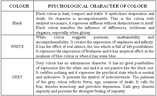
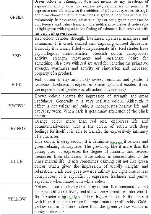
Table 1. Significance of colours
3. EXPERIMENTAL PART
3.1. Method of correlation rank
The method is based on the fact that each of the experts (m) who is taking part in examining, that is in evaluation of the object (n) gives to each object some number as a rank of that parameter. The best ranked object gets the rank 1, the next gets the rank 2 and so on. In such considerations the criteria of optimality of the technological process appear in the role of the object most often. If we mark the ranked number with uij which i expert has given to j object, where i = 1, 2, ..., m; j= 1, 2, ..., n.
If some expert gives to different objects n1, n2 ,... the same rank, (number k ), then in the upper table k<n . Let us supposes that there are n=12 objects which are evaluated by m=10 experts giving each of objects one of the numbers between 1 and 5. If k=n is the sum of ranks given from each of experts n – to the objects, it is equal to the sum of natural numbers as presented in the expression (1):
Some accidental variable X can be most often presented numerically or attributively. If it is presented attributively, the model of rank correlation is applied on it as the mathematical model. The strength of bonds among the arranged marks is measured by Spearman coefficient of rank correlation of the given expression (2) ,
 (2)
(2)in which d denotes the difference in the phases of two rank values. The presented formula in the concrete application of variables can be presented in different ways, depending on purpose serving quality of the mathematical model. The degree of opinion agreement of experts in the considered example is performed in the variant of M.G.Kendall. The opinion accordance of the experts according to Kendall is determined by the expression (3):
where m is the number of experts, n is the number of objects (questions) presented in table. Each of the mentioned m experts (examinees) in the performed poll gives to the given question some number uij as the ranked parameter in relation to some other questions. It is also allowed that the same expert gives the same rank to different questions. It is agreed that the best ranked answer gets the parametric value 1, that is the rank 1, the next one gets the rank 2 and so on. The mentioned table in the mathematical modeling is called matrix and it is in vector space of questions the record of linear operators that gives the number k, to the determined term, where k . n . If k=n :
In the observed model k<n , and the objects get so called standardized rank. The standardized rank is defined as analytical middle of the sum of places occupied by the objects with equal rank k . In the standardized table the column Ti is calculated. The element of that matrix is calculated according to the expression (5):
where tj is the number expressing how many times j rank is repeated in i line of the matrix. For Kendall 's coefficient W is 0<. W < 1 . As this coefficient is probability, it means that, if W is nearer to one, the opinions of experts are more in accordance.
4. RESULTS AND DISCUSION
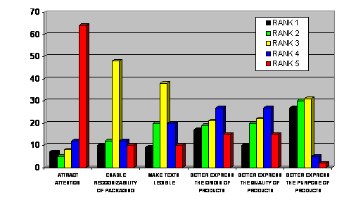
In diagram 1. the colour evaluation results are presented as parameters of information which they carry on graphic design of packaging. The examinees have evaluated that colours on packaging gives best information about the quality of the product. 15% of them evaluated that parameter with excellent mark, 28% with very good about 44% with good mark and 1% gave the mark insufficient to colour. It is obvious that colour is one of the most important elements of packaging and with its determined nuances it can transfer a lot of information about the product. The majority of producers think that golden colour presents the sign of high quality, because gold is the sign of something very valuable and reliable. If the product is packed in valuable packaging it is probably valuable product with very high quality.
Dijagram 1. Informacije koje boje pružaju na ambalaži
Diagram 1 presents information which colours give on packaging; the same is with black colour which expresses seriousness or nobleness, and the quality of the packed product has to be stressed. It must be pointed out that colours, except causing some expectations, can influence the real experience in contact with some product and packaging or the domination of some colour can push into the second row the messages of other colours. The message of one colour can be unambiguous and of another colour ambiguous. All that proves that in packaging design all the factors must be taken into consideration which influence its shaping. Colours as the information carrier have a special role and they will best express the properties of the packed contents. The next rank was given to the parameter of information which says that colours make the texts legible. The greatest majority of examinees, 38% evaluated that parameter with the mark good, 20% of the examinees gave the marks excellent and insufficient and 40% gave the marks good and sufficient. According to examinees, the colours contribute to quicker and clearer reading and message noticing. Colours are used for printing the titles and subtitles on packaging. The texts of particular colours are more legible than of the others if they are applied on packaging surface of complementary colour. The black text on yellow background is read best, and the green text on orange background is read worst. The suggestion for those who design the packaging is to use the table in order to achieve best results in colour and text legibility. Of course, from the point of view of examinees, the size of letters of textual information had great influence on legibility, as well as the intensity of colours, the type of illumination and the distance between the packaging and the observer. Rank number three was given to the parameter - information which enables the recognition of packaging. Almost 40% of examinees gave the mark good, while the rest was equally divided among good and bad marks. 30% of examinees gave the mark very good and excellent to information and the same number gave the marks sufficient and insufficient. Colour obviously enables the recognition of packaging and increases its visibility and motivates the consumer to make impulsive decision for purchasing.
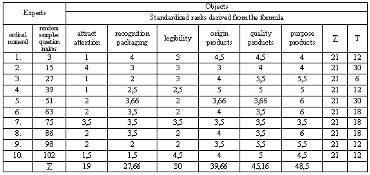
Table 2 . Standardized colour evaluation ranks as information carriers on the surface of packaging
Table 2 Standardized ranks of evaluation of colours as information carrier on packaging surface. Colour contributes to greater protection of packaging, it warns at the product quality. It expresses different but similar products. The producers have intention to colour their packaging so that it is falls into somebody's eyes while standing next to other similar products, of different brands and different producers. In this way the consumers get used to connect the determined colour with the determined product, that is with the producer. If we want to achieve the success in selling the packed products, colour must be used as information carriers. In this way the design of packaging will correctly inform the purchaser av=bout the quantity, kind or quality of packaging. It can be said that particular colours are more appropriate for some determined products and they inform the purchaser about the origin of the product, its value and characteristics and about the producer. Such coincidence makes the mediation considerably easier between the consumers and packaging. This affinity can originate from the similarity of colours of packaging. Colours contribute that packaging becomes a good purchaser of products because it attracts attention, it increases the visibility of packaging and additionally motivates the consumer in impulsive decision for purchasing. For the products that have green chlorophyll colour, the green colour on packaging will be used. And for metal products the dark colours will be used which will correspond to their tones. What is most important on the product is stressed by attractive colours. The evaluations of the examinees are given in table 2 and the standardized ranks are calculated.
5. CONCLUSIONS
If we want to achieve the success in selling the packed products, solours must be used as information carriers. In this way the design of packaging will correctly inform the consumers about the contents, quantity, type and quality of packaging. It can be said that particular colours are more suitable for particular products and they instruct the consumer about the origin of the product, their value and their characteristics and their producer. Colours can better point out the effectiveness of packaging. They contribute to the impression of its size, strength and protection, because the user often puts the question about its fragility. Colours of the graphic design of packaging can stress the quality of the product and inform about the colour of the product. They stress all that is desirable and the less attractive colours are used for everything of the secondary importance. From all that can be concluded that colours have important place in creation of packaging, so that the properties of packaging are stressed in the presentation of the products and informing the purchasers. By evaluation of the examinees, the rank of correlation was obtained, which is 0,389, which points at weak correspondence of answers.
References:
[1] Bessen, A. H.; (1994). Design and Production of Corugated Packaging and Displays , Jelmar Publishing Co., Planview, 1994.
[2] Favre, J. P. ; (1969). Color Sells Your Package , ABC Edition, Zurich , 1969 .
[3] Jackson, C ., (1991). Colorme Beautiful Ballantine Books, Jelmar Publishing Co., New York
[4] Karstedt, K ., (2002). The Future of Digital Package Printing, Pira International, UK
[5] Keller, R ., (1981). Uloga boja u dizajnu ambalaže i prodaji proizvoda, savjetovanje Ambalaža i marketing, Zagreb
[6] Matveev, P.A.; Levin, S.; Majdrin, D., (1985). Proizvodni procesi u tiskarstvu - projektiranje i prora č un , str . 82-85, Kniga , Moskva
[7] Petz , B ., (1997). Osnove statisti č ke metode za nematemati č are , str . 199-205, Naklada Slap , Jastrebarsko
Authors: M.Sc. Jurečić Denis, Ph.D. Darko Babić, B.Sc. Lajić Branka, Faculty of Graphic Arts, Department for projecting, packaging and printing finishing, Getaldićeva 2, Zagreb, Croatia, phone: +385 1 237 1080, fax: +385 1 2371 077, e-mail: denis@grf.hr